Who Muzziball is and why a sensory device needs a companion app
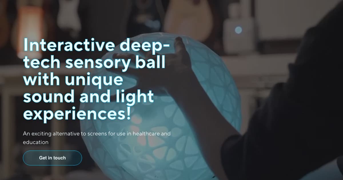
Muzziball AS was started in Stavanger by violinist and inventor Ingerine Dahl together with Aleksandra Jankovic after the 2023 Spor performance at Kilden, where Dahl worked with people with special needs for the first time and saw how strongly music and movement pull people in. The product is an IoT sensory ball in 38 cm and 68 cm sizes, with a recyclable, shockproof PETG shell and a disinfectable surface, that responds to movement with light and sound: keep the ball moving and the content keeps playing. Its customers are institutional — municipalities, hospitals, elderly homes, kindergartens and schools — and the company positions it for people with autism or dementia as well as general learning, play, focus and mindfulness use. Muzziball was also one of four Norwegian companies selected in a round of the EU’s Women TechEU program.
The ball itself has no buttons and no screen. Every choice about what it plays, how bright it glows, how sensitive it is to motion and when a session ends lives in the app — the product’s activation and content library: Android and iOS, Wi-Fi and Bluetooth, certified Muzzi-Method programs, volume and sensitivity settings, statistics, an alarm and scheduling function and custom-program upload. That makes the app less a marketing add-on than the control surface for a healthcare device, and it has to work for a caregiver whose hands and attention are mostly on the person in front of them. Muzziball asked Sigi to design that control surface: the UX architecture, the screens and a design system its engineering partners could build against.
The UX problem: controlling therapy sessions without stealing attention
Three constraints shaped the brief.
- Split attention. A therapist or special-needs teacher runs a session with the ball in a child’s hands or an elderly resident’s lap; the phone is glanced at, not studied. Controls needed to be operable with a thumb and readable at arm’s length.
- Sensory sensitivity. Many Muzziball users are autistic or living with dementia, so a sudden jump in brightness or volume from a mis-tap is not a minor bug — it can end the session. The interface had to make large changes deliberate and small changes easy.
- A growing content library. Muzziball’s programs are certified Muzzi-Method content grouped into Learning, Play, Focus and Mindfulness, and the company promises customers continuous content upgrades. The app had to present a catalog that will keep expanding and still feel calm.
Pairing added a fourth wrinkle. Institutions own several balls, share them between rooms and hand phones between staff. Onboarding had to be repeatable by someone who has never seen the product, and the app had to be honest about device state: powered off, asleep, not found or waiting on a firmware update.
The stack we built it on
Sigi scoped the engagement as design-led product work rather than a coding build. The deliverables were an information architecture for the app, high-fidelity screens for iOS and Android, an interactive Figma prototype and a mobile design system with tokens for color, typography, spacing, elevation, state and density. Reusable components — buttons, tabs, bottom sheets, sliders and alerts — were built as variants so a development team can map them one-to-one onto native or cross-platform components. This is the same handoff discipline behind our UI/UX design service: the file is the specification, not a mood board.
The decisions that carried the most weight:
- Session-first navigation. Once a ball is paired, the live session controls sit one tap from the program library and the device settings, because the common job is adjusting a session already underway, not starting a new one.
- Sliders, not steppers, for continuous parameters. Volume, brightness and sensitivity are all continuous, so each is a large slider with its current value shown, rather than a stepper that needs several taps to move across the range.
- Explicit device states. Instead of a generic error toast, the app has designed screens for wake, power, “device not found” and firmware update, plus an in-app feedback screen, each with a single recommended action.
How the platform is built and run
This was a design-led engagement, so the deliverable is a build-ready Figma package rather than running software:
- A token-based mobile design system — tokens for color, typography, spacing, elevation, state and density — with reusable components (buttons, tabs, bottom sheets, sliders, alerts) built as variants a development team can map one-to-one onto native or cross-platform components.
- High-fidelity iOS and Android screens and an interactive Figma prototype covering the full flow, from onboarding and pairing through the program library, live controls, device settings and the custom-program builder.
- Accessibility written into the system as a specification: text contrast to the WCAG 2.1 AA 4.5:1 minimum, text labels rather than bare icons, touch targets sized for the session context, and designed empty and error states.
- A handoff-ready Figma file organized in layers — foundations, components, screens, prototype flows — with tokens named for export into a codebase and each screen annotated with its states, behavior and accessibility notes.
What we designed: the Muzziball companion app screen by screen
Sigi designed every screen of the companion app in Figma. Here is what we designed, in the order a session runs.
The order below follows Sigi’s published prototype walkthrough, which runs from onboarding and pairing through the program library, live controls, device settings and the custom program builder.
Onboarding and device pairing
- Brand splash and a short explanation of what pairing does, written for staff who did not buy the device
- Camera permission request with a plain-language reason shown before the OS dialog appears
- QR-code scan of the ball, then Bluetooth pairing with a progress state and a clear “device paired” confirmation
- Support screens for wake, power and “device not found”, each with one next step, and a feedback screen for reporting a problem
Program library and live session controls
- Category grid across Learning, Play, Focus and Mindfulness, presenting Muzziball’s certified specialist content
- Live session controls with an oversized play/pause, brightness and volume sliders and a dedicated safety control for stopping a session
- Custom program builder: light-spectrum controls, rainbow and bounce color options and an audio-file picker, so a therapist can save a routine and reuse it
Devices and settings
The devices area is where a caregiver selects a ball and tunes it. Quick settings cover the parameters a session needs most, with advanced settings a level down:
- Volume — set per ball
- Sensitivity — how much movement it takes to keep the content playing
- Bounce — the light and sound response when the ball is dropped or rolled
- Advanced: Wi-Fi setup and firmware updates, kept off the quick-settings path so routine adjustments never touch them
Muzziball’s product page also lists usage statistics and an alarm/scheduling function for the app. Those surfaces are not part of the published walkthrough; the design system’s list, form and empty-state components are the building blocks they would be assembled from.
Accessibility and design-system practice
Accessibility was written into the design system as a specification rather than checked at the end. Text contrast targets the WCAG 2.1 AA minimum of 4.5:1 for body and control text, actions carry text labels rather than bare icons, touch targets are sized for the session context, and list and device screens have designed empty and error states so nothing is ever blank.
The Figma file is organized in layers — foundations, components, screens, prototype flows — with tokens named so they can be exported straight into a codebase. Each screen is annotated with its states, behavior and accessibility notes, so the development handoff does not depend on a designer being in the room. That matters for a small hardware company whose app may be built by a partner team, and it is the reason a design system was in scope at all rather than a set of standalone mockups.
The team and expertise behind the build
The Muzziball app was designed by one cross-functional Sigi team — product strategists and UI/UX designers working as a single unit, with the engineering handoff built in rather than passed between vendors. Sigi hires only specialists: every designer and engineer is an expert in their own field, and we invest in the team as they deliver, supporting certifications and continuous learning so expert, motivated people stay on every build. It is the model we have run since 2015: deep, cross-industry expertise, here applied to a healthcare device where a mis-tap can end a therapy session — from the information architecture and the token-based Figma design system to an accessibility specification a development team can build against. Designing a calm, accessible control surface for a medical-adjacent device is exactly the kind of careful, user-centered work our team is built for — the same capability behind our UI/UX design and mobile app development work.
What shipped: a build-ready design package for a healthcare device app
Muzziball received a complete design package: an interactive prototype, iOS and Android screens, a token-based design system with reusable components, and an accessibility specification that travels with the file. Sigi published the prototype walkthrough in October 2025. The outcomes are qualitative: a calm, low-cognitive-load interface for clinics and classrooms, faster onboarding through guided pairing, and a design system ready for new content and devices. This engagement covered the design and UX architecture.
Ingerine Dahl, CEO of Muzziball AS, described the product in Scan Magazine in September 2024:
“Muzziball is a plug-and-play, user-operated health tech sensory ball that produces personalised, interactive light and audio experiences for people of all ages.”
You can read more about the device on the Muzziball website.
Related work in healthcare and design-led mobile products
For software built around care workers rather than consumers, see the Allfor Care services platform; for a product aimed at classrooms, the Alpha Academy learning platform. Our healthcare and education practices cover the regulatory and accessibility ground that projects like Muzziball sit on, and our mobile app development team can take a design package like this one through to a store release.
If you are building an app that controls a physical device — a sensory tool, a wearable, a piece of clinic equipment — and need the UX and design system done before a line of code is written, talk to Sigi about a design-led engagement.